
As far as I can make out, "efficiency" means that we ought to discover everything about a machine except what it is for. - G.K. Chesterton
Aurora Bedford writes about the phenomenon of "more efficient" website workflows that nonetheless flummox users who are used to more complex, "inefficient" versions of the same tasks:
...it’s common for many websites and applications to try to reduce the amount of steps—often, clicks—that a user must do in order to complete a task. However, interaction cost is more than just the number of clicks (or other physical actions)—it also involves mental effort. There are times when focusing purely on the number of steps actually backfires: instances when users are so accustomed to the “inefficient” process that streamlining it is perplexing and breaks the task flow.
Bedford recounts the example of an Email Settings form with no Save button:
What is missing from this otherwise fairly standard form? There is no Save button! How do we apply our changes so they are saved in the system? Computer-savvy readers may realize that the form is likely saving any changes whilst they are made, thus gaining efficiency by not requiring an extra save button press. However, most users are not this savvy, and even the savviest amongst us are more used to the pattern of having a Save or Submit button at the end of a form. This is an excellent example of how even the smallest deviation from a standard can cause confusion and increase cognitive load.
I recently encountered this myself when trying to post an image to a blog hosted by Squarespace.
First, I went to the New Post editor:
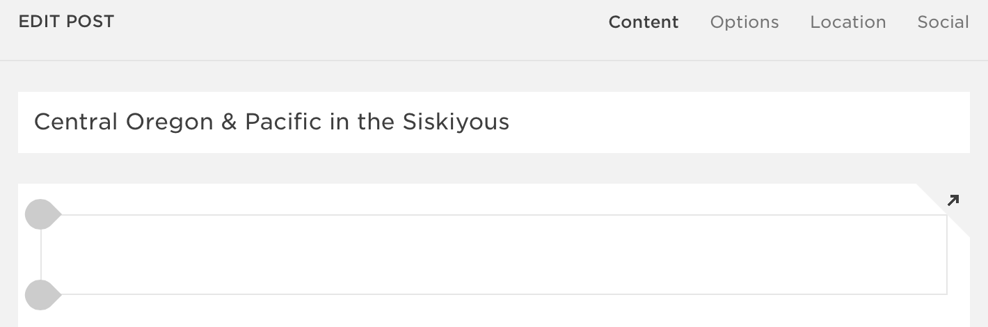
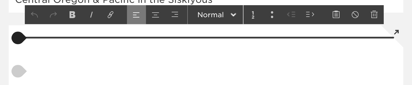
The title was easy enough to place. And if I wanted to write, I would just click in that text area with the two gray blobs and start typing. But how would I post an image? I hovered over the text area:
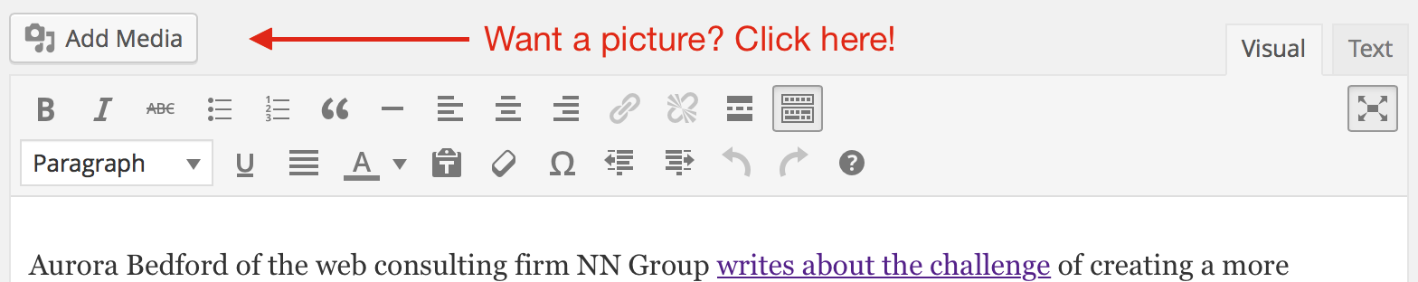
Hm. Okay. None of those look like the usual add media options. See, I'm used to Wordpress; it's far and away the most common blogging tool out there (it runs this blog, for one). And for all of its various irritations and flaws, its WYSIWYG editor is unambiguous when it comes to uploading media:
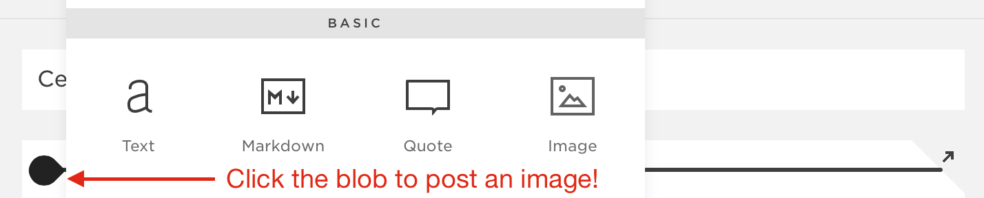
I scrutinized the Squarespace interface, even going into the blog's settings to see if I needed to somehow enable images. Nothing worked. Finally, I clicked the Help link and searched their articles for How to post an image. This article enlightened me. Turns out I needed to start by clicking one of those gray blobs:
From that point on, posting the image was simple and straightforward. But to get to that point, I had to jettison everything I know about adding an image to a blog post and learn how to use an idiosyncratic interface element I've never seen anywhere else.
Sure enough...
...users spend most of their time on other sites... When reaching your site, they expect it to function in the same way as on those other sites—any slight deviation from their norm snaps them out of autopilot and forces them to think and try to find an action that matches this novel situation.
How does this dynamic work with Populi? What expectations do people bring to our software? Here are a few things we've learned and observed...
- Being web-based, we can build on the ready-made language and conventions of web design to help new users intuit how to use Populi. There's a lot about our service that requires no explanation.
- For many schools, Populi replaced other types of software. Perhaps a spreadsheet program from a productivity suite. Maybe a homegrown database. Or another program repurposed for running a college. When a school leaves such a program behind, it's a pretty clean break: users don't expect a web app to behave like Excel.
- Other schools came to Populi after years of using terrible purpose-built college software. Some systems didn't do as much. Other systems did a lot "more". Some were just unreliable and incompetent. Each one inflicted a peculiar kind of suffering that drove the school into our embrace. This provided another clean break: as long as Populi isn't anything like that last system, we're good!
- We've run into this phenomenon with Library. Populi Library is built on the web-capable Dublin Core, but most libraries (and their software) traffic in the more established, but creaky, MaRC format. We've designed our search for simplicity; most library software gives you every search option, ever, on one screen. These, among other differences, have coaxed us into a different approach towards Library improvements than we initially envisioned.
- Nothing exposes this like a feature update. Our customers use Populi day-in, day-out, so new features invariably break old habits. For example, when the Admissions overhaul improved Populi in every way. But several users told us they preferred the old version—simply because they were used to it! Better as it was, the Admissions rewrite nonetheless caused the cognitive strain Bedford describes. Something similar happened when we rewrote Courses, and even when we changed the old search field to a "hidden" search tab. It wasn't that these features were a devolution; new users had no problem picking them up. But for those who had gotten used to the old way, the "improvements" didn't improve their workday (initially, at any rate).
Good software is built on a basic empathy for the user. Usually that means that we reduce complexity and pare things down to their simplest, most efficient expression. But people are complex, and we can't just mechanically assume that software simplicity begets efficiency. Hopefully, we'll always keep learning this lesson.
After all, software is for humans, and humans are not for software.