Ever since we launched Populi, we've included customer support free with every pricing plan. Our schools get help via email, phone, and the Knowledge Base starting the day they sign up and every day following. We've always wanted to make it easy to get answers about Populi.
But some questions come our way that are a bit beyond what we're fit to answer. What's the best way to use Quickbooks for a non-profit? How do you handle access for accreditation staff? What's your policy for online course attendance? And so on. These are questions not so much about Populi as they are about the best way to run your school (and how Populi fits into that). On those matters, we like to defer to the experts: other users. Among our hundreds of customers, we have schools with a wide variety of shapes, sizes, and missions—and, we're sure, someone who has puzzled through your very problem and now has wisdom to share.
You can seek out that wisdom—and share your own—on the Populi User Forum. The Forum lets our users pose questions about best practices, school policies, workflow ideas, and so on—basically, anything having to do with running your school (including how to use Populi to make that happen). We encourage you to get on the Forum; a simple way to keep an eye on it is to subscribe to email updates. These will alert you to new topics, comments, and replies. Here's how to subscribe:
1. Go to the Knowledge Base
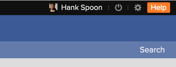
Click the orange help button in the upper right corner of Populi. Or, go to Populi Support and log in with your regular Populi login credentials and your school's Populi URL.
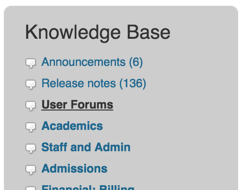
2. Go to the User Forum
In the right column of the Populi Support landing page, you'll see a list of Forums. Click User Forums.
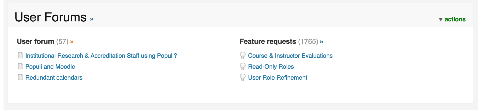
You'll then see links to the User Forum and the Feature Request Forum. Click the User Forum heading.
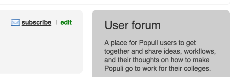
3. Subscribe!
Near the top of the screen, you'll see a subscribe link. Click it, and you'll be subscribed—that's it! Now, whenever someone posts or updates a new topic or comment, you'll receive a message about it at the email address marked Primary on your Populi profile.
Of course, everyone here is keeping an eye on the User Forum, too. We think it's a great opportunity for our users to help each other out and learn more about making Populi do the most for your school.


